Devlog #06 The Legend Starts Here
👉 Join our Discord:
https://discord.gg/jwc5bq9CkN
Hi everyone,
In our last post, we talked about how our vision for the final game has evolved, and while some changes, made by choice, others by necessity. We also outlined our design pillars and defined what kind of game we truly wanted. In that case, what we came up is :
[Firva: Strings of Fate Must be a story-driven action-adventure with cinematic atmosphere scenes and set pieces, set in a rich, grimdark world and tone, with engaging combat.
Players will step into the darkest fate as Firva, driven by vengeance and bound to revenge, mastering the precision of parrying or the thrill of dashing through danger.]
With this new identity taking shape, we realized the best place to begin was not with new gameplay features (even due there are a lot to cover there) but with our visual identity. Our old logo, icon, and logotype no longer reflected who we’ve become or the story we want to tell.
Even due Much of our narrative remains intact and, in many ways, improved, but we needed a new symbol that truly communicates the soul of our world: something ancient, majestic, and steeped in legend.
FIRVA is identity reflects a world where <b class="_3cln317VYhwhE1fSeMCG48" <threads="" of="" destiny<="" b=""> bind every being mortal and divine through >b class="_3cln317VYhwhE1fSeMCG48">forged consequence</b>. The visual language balances ancient mythic weight with modern narrative clarity, creating a world that feels eternal, sacred, and beautifully doomed.
Before we move forward with the redesign, we want to take a moment to look back at what our old logo represented, how it shaped our early creative direction, and what we learned from it.
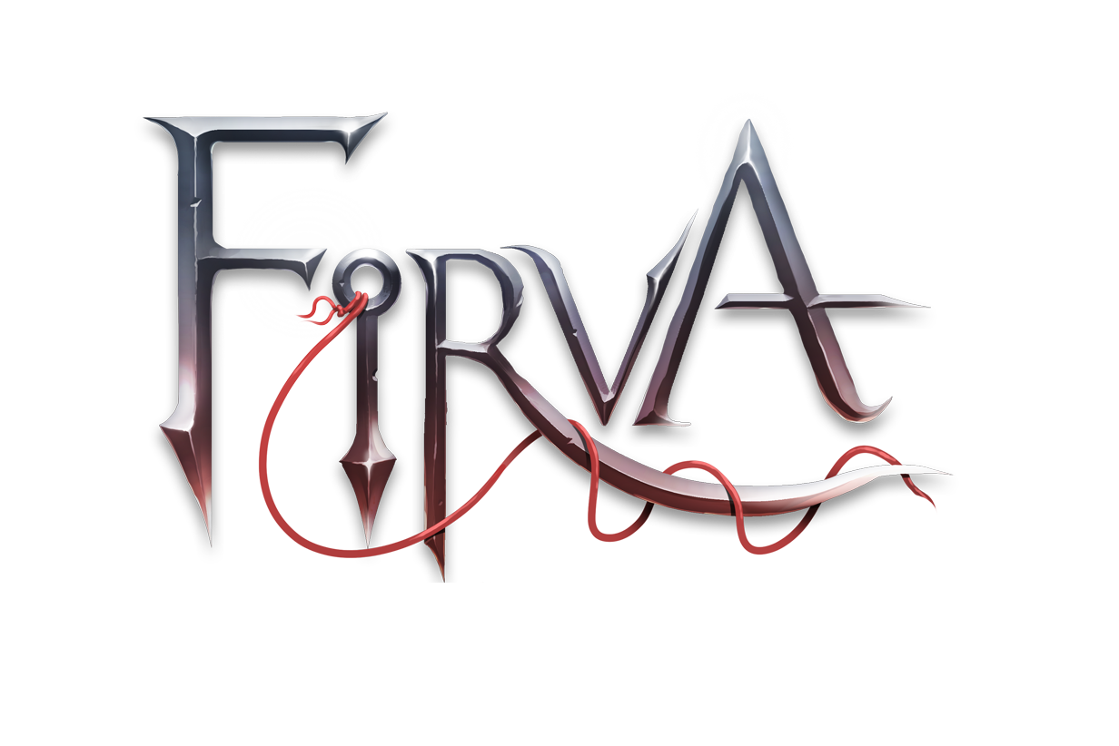
Image of Old Logo Type of Firva (Not in Use anymore)
1. Typography & Form
Our original logotype was crafted using a sharp, custom font designed to look aggressive and dangerous, as though each letter could cut your hand. The typeface was metallic and stylized, evoking forged steel and weapon edges a visual language that resonated strongly with fantasy and action RPG aesthetics.
The pointed ends and beveled surfaces on letters like F, R, and A suggested strength, tension, and destiny, aligning perfectly with our strings of fate concept.
The <b class="_3cln317VYhwhE1fSeMCG48" <varying="" stroke="" thickness<="" b=""> and >b class="_3cln317VYhwhE1fSeMCG48"<subtle curvature<="" b=""> introduced a sense of motion and organic energy, balancing rigidity with fluidity symbolizing the clash between >b class="_3cln317VYhwhE1fSeMCG48">control and chaos</subtle></b>.
2. The Red String Motif
A defining feature of the design was the red thread winding through the letters. This was more than decoration it was storytelling.
Inspired by the East Asian myth of the red string of fate, which connects destined souls, (even due in the East Asian myth it is mostly used for love) the thread looped through the (R), with letter (I) highly resembling a sawing needle that was going to symbolize the power of sawing destiny with the theme that everything is connected by unseen strings. And interesting point is that the letter (I) unintentionally, ended up resembling a Japanese throwing knife.
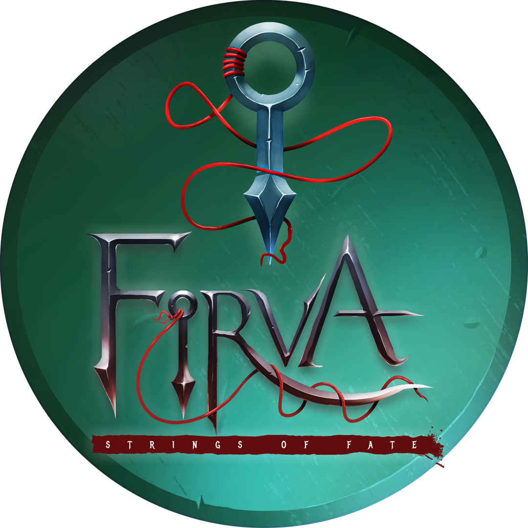
Image of Icon Variant (Not in Use anymore)
3. Subtitle Design: The Strings of Fate
Beneath the title sat the subtitle on a torn red banner, rough-edged and textured to contrast the refined metallic letters above.
The white serif typeface added clarity and poetic rhythm, grounding the design and reinforcing the subtitle as a narrative tagline.
Image of Icon Variant (Not in Use anymore)
The Weight of a Symbol
When we first revealed Firva: Strings of Fate, our logo the sleek, metallic design entwined by a red thread, it represented everything we thought the project was about. It was sharp, elegant, cinematic.
It looked like destiny forged by human hands precise, intentional, and alive.
But as the world of Firva began to deepen, something started to feel… off.
The more we explored its myths, the gods, the rituals, the forgotten civilizations that shaped the Strings themselves, the more the polished surface of the logo felt like an artifact from outside the world, not of it.
So we started digging, both creatively and literally.
From Logo to Relic
We realized Firva should not be a story told by modern hands. It should be an ancient myth inside its own universe to be rediscovered, a world that predated language and memory Our game is identity needed to feel excavated, not designed.
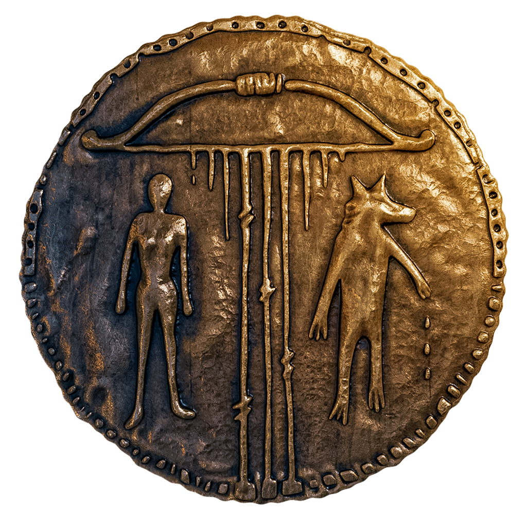
That is how the Relic Coin was born (inspired by Old forgotten Earth empires that told the story of heroes and kings), the circular coin etched with two figures, a bow, and strings of fate connected to it (the bow is a highly important object in our game) It was not drawn on a tablet screen; it was chiseled into stone. It was not meant to be read; it was meant to be remembered.
When we placed the Coin over the cracked Stone, something clicked. It was not a logo anymore, it was a piece of our game-world's truth.
A World Forged, Not Branded
There is a difference between a logo that represents a game and one that belongs to the world inside it. The first design worked beautifully for marketing; it was modern, cinematic, and precise. But Firva has never been about precision. It is about inevitability, decay, the weight of stories that refuse to die.
The Coin reflects that:
It’s uneven.
It is heavy.
It feels older than language itself.
In abandoning the polished mark, we embraced something imperfect, eternal, and human.
Visual Philosophy Shift
When we updated the logo, the entire art direction shifted with it:
Our color palette darkened into embers and bronze.
Our compositions became wider, slower, and more ritualistic.
Even the UI started borrowing from ancient symbols rather than modern frames.
Firva no longer shines; it glows from within. The fire does not reflect off it; the fire is it.
What We Learned
Art direction is not about what looks beautiful; it is about what feels inevitable. The Coin was not an upgrade; it was a revelation. It reminded us that Firva is not trying to sell a story. It is trying to remember one.
We left behind the thread and found the forge.
And in doing so, Firva finally found its voice.
Final Reflection
We thought we were designing a logo.
Turns out, we were uncovering a relic.

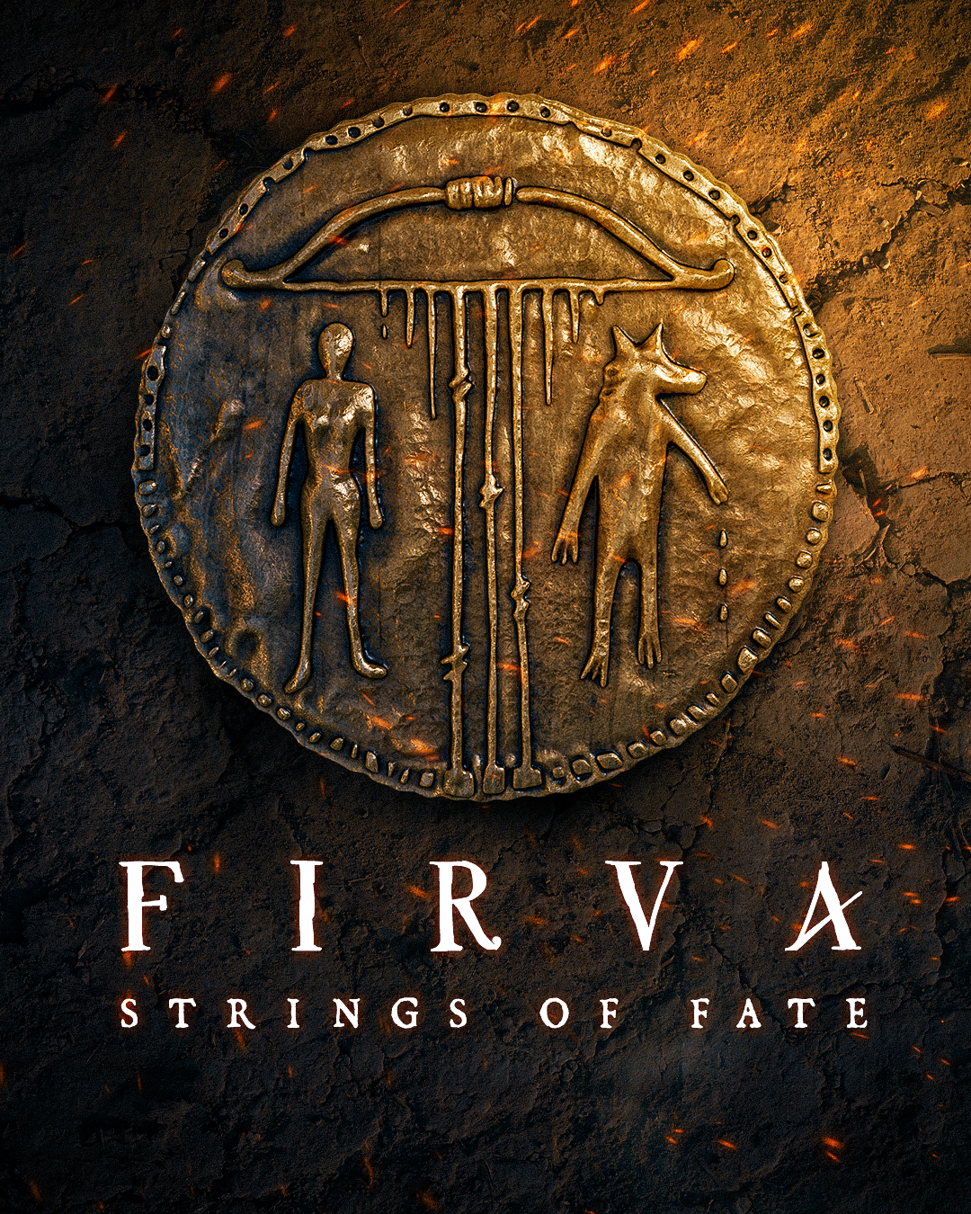
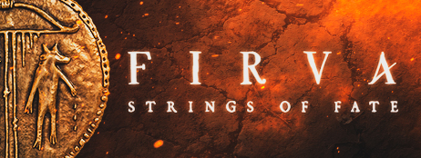
Images is the Main and Final design
The change is not just visual, it is philosophical. The new FIRVA emblem is more than a title screen; it is a key.
A door into a myth that doesn't want to be told, only rediscovered.
So, let's dive into the Decision on the new logo
1. Composition and Symbolism
At the center is a Coin made in honor of old legends, resembling ancient bronze so this could. The engraving depicts:
A bow-like shape at the top, representing a divine instrument, the literal string of fate
two figures beneath it:
One human-like, representing mortality, order, the mortal world.
One animal-headed (wolf figure), symbolizing instinct, death, and the supernatural.
The descending lines from the bow connect the two beings, implying threads of destiny, life force, or divine control.
This imagery suggests duality: human vs beast, order vs chaos, fate vs freedom, all bound by an overarching cosmic mechanism.
Images is the Main and Final design
2. Materiality & Texture
The coin is designed to look hand-forged, with visible imperfections and weathering, communicating ancient myth and lost civilization.
The background of cracked stone, glowing embers, and faint heat distortion conveys an atmosphere of rebirth, destiny, and eternal conflict.
Subtle molten orange lighting hints at forging, fire, destruction, evoking the sense that fate itself was forged in flame.
💬Join the Conversation
We'd love to hear your thoughts, questions, and feedback. Join our community on Discord
or leave a comment below👇
Leave a comment
Log in with itch.io to leave a comment.